[ Disclaimer ]
1) Those reviews are full of spoilers, so don't read them if you want to avoid those.
2)I had written all this during the week not really knowing how it would be used, or if was going to be published; so the writing style is a bit formal. I wrote in an objective, almost cold manner, simply following the establish criterias of judgement. I hope I wasn't too harsh. Also, note that I judged these Ages strictly in the context of this contest; ie: I didn't think much about the potential for future development or refinement of the Ages, but rather how they were at the moment I saw them. So some of the criticism I wrote probably doesn't make sense if we take in account the future plans for those Ages.. Sorry about that.
In the end I should probably just re-write most of this, but I just don't feel like doing it. I still hope this will be usefull as a constructive criticism of sorts. If not feel free to PM me and insult me.
"Abysos" by Trylon
Content: 2.5/5
There's isn't much here: the landscape is quite bare, safe for a wrecked boat, there are no journals, or artifacts of any kind. But that's all part of the atmosphere of the Age.
By walking around the chasm I was able to fell into it and discovered there might be more to it that meets the eye down there. But not much to see in the present version of the Age. Unfortunately once I had fallen down there I couldn't get back up.
Finally there's a sea you can walk in, but not swim in.
Creativity: 2.5/5
A mysterious desolate beach with a wrecked boat might not be the most original setting for an Age (Stoneship, Haven, even Myst), but the large chasm and the air of mystery it conveys add a bit to it.
Functionality: 2/5
There is not much in the way of interactivity but that doesn't seem to be the point of the Age. I had fun climbing the cliffs trying to find some hidden tunnel. Also there is what look like a wooden box or pylone near the chasm but there's nothing you can do with it (not even collide with it...) Speaking of which some collisions are odd, all of the chasm is surrounded by an invisible wall safe for a small spot where you can fall and land bellow inside the chasm. But you really have to like exploring every corner to find that spot..
Aesthetics: 3.5/5
I like the desolate, almost cold atmosphere of the Age. That large empty landscape, the greyish colors, and the wrecked ship. I could almost hear the chilling wind sound; too bad there wasn't actual sound.
The textures aren't the best but they do their job; the sky stands out quite a bit though, very nice.
Mapping issues have been mentionned previously. Of note is the extensive use of material blending throughout the Age which works well for such a landscape.
Stability: 4.5/5
No problems of any kinds here.
Quality: 2/5
The Age has a strong feeling of 'work in progress'. Some objects don't have collisions, there are a number of texture mapping issues. There's a small dead-end tunnel in the cliff that hasn't even been mapped at all.. However there is some good use of detail texture mapping, which isn't common and is used to good effect here.
The modelling work on the Age isn't too detailed but somehow the boat model is pretty nice. Maybe with a bit more work the whole Age could be as nice as this boat.
Finally there is no ambient sound which is too bad.
Economy: 4/5
Polygon counts and textures looks decent. The texture for the sky might be a bit large, but I'm nitpicking here; nothing that can hurt performance.
Overall: 2.7/5
It might not be on par with other Ages in the visuals or content department, although it is technically very good, and it might not be too original, but that Age has a certain atmosphere going for it, and it definitely holds some potential for future developments. In the end this Age really feels like a work in progress; so it might not rank high for this contest, but it is certainly an Age worth keeping a close eye on in the future..
-----
"Shell 119" by Grogryan
Content: 4/5
At first sight this shell look like a nice stone temple with a ladder leading to some floating area. In fact most of this shell is simply a maze, in fact two mazes. Nothing that we haven't seen before, but the whole shell is really focused on this and it doesn't pretend to be anything else, with some story thrown in. No journals here, nothing but two fun mazes.
That first maze is an original one, it is a bit of a mix between the pyramind puzzle in Kadish Tolesa and the 'Lion head jump' in Indy and the Last Crusade. And once you understand how it works it is quite enjoyable. Having a second maze might sound a bit too much at first, but because it is easier than the first one it works pretty well.
The overall idea of having that shell focused on two mazes puzzles works well for an area of this size. Also I liked that there's a small reward at the end of the journey.
All in all that shell provides for a good half hour of fun, and even more if you want to explore all the corners of the underground area. (although there is nothing to see here beside the final reward)
Creativity: 4/5
That first maze is an interesting twist on the classical maze puzzle, the fact that you actually walk on air adds some interesting tension. The second maze is a more regular maze, but the fact that it is filled with water sets it appart a little bit, but the colorfull setting of that second maze is what definitely set it appart.
So this is a maze, but an interesting one.
Functionality: 2/5
That first maze has a real problem: it is just too high, and each time you fall you have to climb that horribly long ladder.. After my second fall I used the fly mode to get up there faster.
Aesthetics: 3.5/5
The area lacks any form of lighting, and although that may come from the Age it's in (and that would be my fault), it brings down the visual quality quite a bit. Also the lack of lighting in the underground area holds no excuse.
The architecture of the outside area and the floating hexagon-based maze are a very intringuing setting at first sight. Also the colorfull murals in the second area are original and provides a nice contrast with the classical looking outside area.
Stability: 5/5
No real problems.
Quality: 2.5/5
The little orange hexagons objects display some serious flickering problems; which is a bit annoying visually.
The fact that you have to climb up the ladder each time you fall is quite annoying, the problem would be less annoying simply if the ladder was much shorter.
When you complete the first maze and you fall in the hole, the camera goes out of control for a moment.
Footsteps sound are lacking in places, but at least correct swimming footsteps sounds are used in the second area.
One big problem I have with the first puzzle is that it requires you to use first person view to find the clue to solve it, and many people never uses first person view in Uru... In my opinion no puzzle should require the player to use the first person view. A nicer way to handle that situation here would have been to hide the clue somewhere the third person camera can see it, maybe somewhere on the back of the temple structure, near the ground.
Other than this, that shell is pretty solid as a whole.
Economy: 4/5
It is difficult to judge the performance of the area being part of a larger Age, but from what I can see the number of polygons and textures look very reasonnable.
Overall: 3.8/5
At first sight a maze is nothing too original, but this shell is original enough to be interesting, and well done enough to be enjoyable. I had some fun solving it, and I'll definitely play it again in the future.
It's just too bad that this ladder is so darn long..
-----
"Shell 201" by Paradox
Content: 4/5
This area is something truly unique. There is virtually nothing except an irregular stone ground and some whimsical lights magically shifting all over it. Nothing more, not even a piece of rock or a brick lying aroud.
Well, thinking of it there is something else here: a featureless dark glass roof. Which perfectly make you focus on what's inside the shell, and makes you forget about the outside city.
The only way this could possible be enhanced would have been by placing a door in the entrance, so you can totally cut yourself from the rest of the world.
It's interesting to know that this lighting feature was originally a bug, and the shell has then been focused all around it.
Creativity: 4.5/5
Again there is nothing in this shell, and this is what makes it so great. It is strictly focused on one single thing: its unique lighting effect; and it does it perfectly. This makes for a very unique, almost magical atmosphere.. Paradox mentionned how it would be nice to have some good techno music in there; somehow I'd rather think of this shell as whimsical; almost magical; and very relaxing. I spend a good deal of time just walking around to watch the colors shift on the floor..
Functionality: 1/5
Well there is trully nothing to do here, beside walkin around and looking at the ground. Personally I think this 'feature' alone is very well used, but it is the only feature of this area.
Aesthetics: 4/5
Again this area is totally empty simply to focus on its strength. The only real feature is the slight irregular shape of the stone ground, and it is very well done, making good use of textures so as not to look to repetitive.
Stability: 5/5
No problems here.
Quality: 4/5
Safe for a small flickering polygons on the walls, there is really nothing to complain about. In fact this shell even goes as far as using a bug (the dancing lights) to turn it into a great feature.
Footsteps are used but for some reason they stop working when the avatar walks above a certain height.
Material blending is nicely used on the walls, but it creates a small flickering problem with some polygons; nothing too noticeable however.
Finally the lighting is nicely blocked by soft volumes all around the shell, and more softly at the door; nice touch.
Economy: 4.5/5
There exacly 3 textures used for the whole area which has to be a record of some sort.. Along the same line there aren't too many polygons either. This shell is all about performance.
The only problem is that there are many lights, which produces many shadows on the avatar. And that might be a performace issues for some computers. But that's really a minor point compared to the rest
Overall: 4.3/5
This shell is definitely not for everybody, it is unlike anything else, some people might even find it boring. Personally I loved it. And I plan to visit it regularly whenever I walk around the Age.
-----
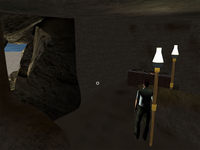
"Zephyr cove" by the GoM team.
Content: 4.5/5
It is easy to see the work that went into this Age. This Age is very large, and it is far from empty both on the visuals and story department. Consisting mostly of two larges beaches, complete with palm trees, and a carvern, it manages to makes all areas interesting. Although the beaches looks empty at first the numerous journals scatterred around quickly explains that, and hint at many more things to come there; although this is beyond the scope of this contest. As it stand this Age has just enough backstory to be believable, and intriguing.
The way it is laid out is quite linear which niecly allow you to learn a little more of the story as you find journals along the road and leaves you wanting for more in the end.
A special mention must be made for the sound. First we have a nice 'sea ambiance' sound, but we also get original music, which not only being uncommon happens to also be a really great music, strong an atmospheric. And that alone adds a lot to the Age.
Creativity: 3.5/5
This Age is not original; it is a sunny beach. But again the story perfectly explains it, and what could first look like a simple 'Eder' Age, soon turns into something more interesting.
Functionality: 3/5
There are many journals providing plenty of reading material; which despite the large explorable area of the Age these journals are really the core of this Age. Unfortunately despite those there isn't much to do, this Age is definitely focused on story. There are a number of objects in the caverns you can kick around; but I wished there was at least a beach ball here. You can have fun climbing the larger rocks though. Also you can swim in the sea, which is enjoyable; but you can't go too far as there is a strong current which is a tad too close to the beach to my tastes.
Aesthetics: 3.5/5
This Age features a sunny beach at the bottom of high cliffs and it does that pretty efficiently. The modelling is solid overally, the texture mapping is a bit lacking in places however, but keeping in mind that this large Age was produced in less than three weeks this is something that can be easily disregarded.
However what I consider to be a really weak point is the lighting. For a start there's a single strong light coming from the horizon, and when you link in the Age the avatar is facing that horizon which means that your back is litterally black with shadows. At first I actually thought there was no lighting in the Age. Unfortunately this is the only light in the Age, which looks especially weird in the cavern, where you could expect a more moody lighting; and not a strong sunlight coming from the outside through the walls.
All these lighting issues are really too bad because it brings down the visual quality of the Age a lot. Some more development time and taking some pointers from some of the sunnier Cyan Ages could tremendously help this.
Stability: 5/5
Nothing to complain about, which is no small feat for such a large Age. A couple collisions here and there could have been rounded out, but I'm being picky.
Quality: 4/5
There are some noticeable footsteps sounds error near the sea, at random in places on the sand you can hear the water footeps sounds, and vice versa. Fortunately there are no such problems in the rest of the Age. Again in the sound department the sea ambient sound tends to end brutally.
As far as visuals are concerned lighting as already been mentionned, now the utterly strange problem of the Black Sea must be mentionned. For some reason the horizon in this Age is black, the texture of the sea litterally fades to black with the distance.. Assuming this is not an odd artistic choice this is a problem that should be fixed.
In the end this Age is pretty solid, and its few problems only make its qualities stand out even more.
Economy: 4/5
Despite being large the Age runs really well. Not too many textures are used and the amount of polygons is quite decent. It is higher in the cavern area, but this remains decent enough so it isn't much of a problem.
Overall: 4.2/5
There is more than meets the eye to this Age. And this is good because the strong lighting and the black sea makes my eyes sad. But those two problems aside this Age is a winner. It It is big, it has a nice atmosphere, an intriguing story, and all of this produced in less that three weeks? One can only be impressed. (And ask for more). As a final note it is important to mention that unlike the other Ages in this contest Zephyr Cove is this only one to have been produced by a whole team; which might explains how such a large was produced in such a short amount of time, but that doesn't lessen its qualities.