What Whilyam said sounds like a very good advice ! I didn't think about it before, but I'll sure try !
normhoffman wrote:a lot of us are just color blind enough to not "see" your subtle pastels
Some fan-Ages have buttons that are barely visible (or invisible ?) no matter whether you're color-blind or not, which is just plain annoying IMHO.
Concerning the repetitiveness of textures, PyPRP is a great way to learn from Cyan's Ages, since the plugin got pretty good at importing multilayering. Let's have a look at Gahreesen, for instance.
This is the first texture for the bridge.
- Show Spoiler
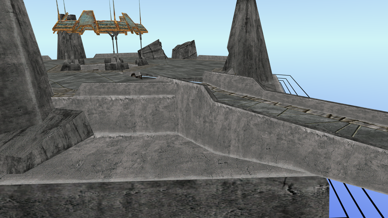
It's well UV-mapped, and very detailed, but feels a bit dull and repetitive when being far from the object.
Now let's look at the second texture of the material.
- Show Spoiler
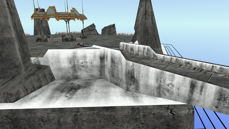
Ok, so it's white, so it obviously won't fit. However, having the stains added to the base texture could be interesting to break its repetitiveness. This is because, with a different UV map, the "tiles" of the first texture will be much smaller than the tiles of the second texture, making it much harder to detect from close up and from afar.
The problem is mixing the two of them... To do so, Cyan multiplied the pixel RGB values of the first textures by the second one. Where the second texture is white, the first texture is unchanged, where it's dark, dark stains will be seen on the first tex.
This is fully supported by PyPRP, it's the drop-down list in the "Map To" panel (by default it's at "mix").
Here's the result.
- Show Spoiler
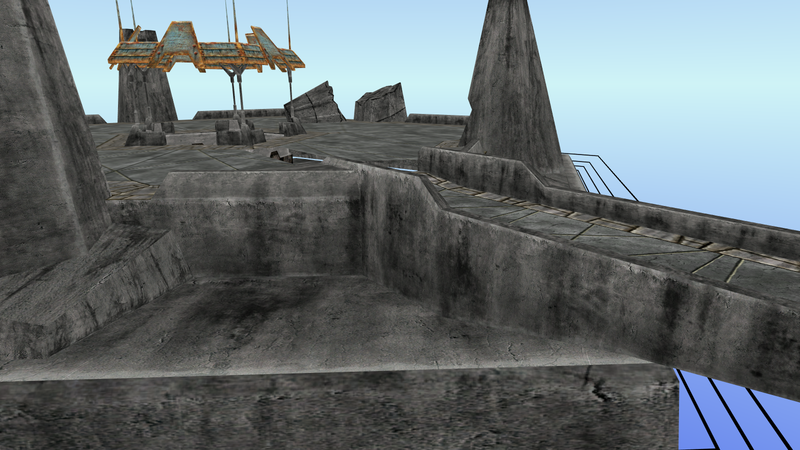
Nice, heh ?
Another thing that bugged me in a few Ages (especially in Myst V), is that the engine dynamically scales-up the texture of an object when you get closer to it. Let's have a look at the base of the planetarium in EoA's Myst:
- Show Spoiler
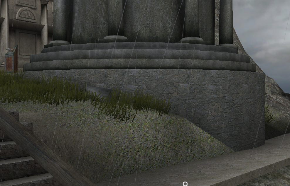
Notice the size of the bricks in the image, and compare it to this close-up:
- Show Spoiler
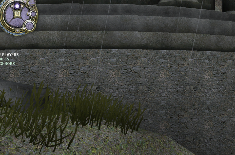
It may be hard to see, but in the second image, the texture's UV mapping is altered to make it feel much more detailed. This is also noticeable on the wall in the corridor under the volcano in EoA.
It's also used to fade beams of lights in various Ages as you get closer to them.
Unfortunately, I don't think this feature is supported by PyPRP, since it's quite tricky to setup.


