This is it! Interface design overhaul!

The art, story, and musical aspects of age creation live here!

This is it! Interface design overhaul!

Postby Yali » Sun Dec 21, 2008 6:56 pm

Here are some rough photoshop mockups of what I've always envisioned the "look" of Uru should be, specifically in regards to the out-of-game interface:

Design no.1
http://www.majhost.com/gallery/Yali/Myst-Uru/menu.jpg

Design no.2
http://www.majhost.com/gallery/Yali/Mys ... 3_copy.jpg

Main screen design
http://www.majhost.com/gallery/Yali/Mys ... 2_copy.jpg

Over and above the interface itself, here are a few "promotional" designs that embody the look I'm aiming for for an artisitically overhauled Uru. Basically, this is regarding everything art related that will be on the outside of the game proper - the whole look and message of the game - yet not within it per se. I think having a strong aura of design surrounding an experience can actually highten the experience itself and further infer a sense of visual order and a message. Think of Riven basically.

A logo design of some sort. Not sure how to use it, but the general style is there.
Image

Alternate design
Image

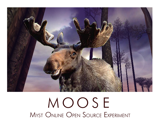
Another "promotional" concept. The design isn't mine, but the layout and logo are.
Image

I edited this ancient Mudpie advert into a neat, more commercial advert. This is essentially the look I'm aiming for - the pre-ubisoft, Cyan style-crafty/artsy look.
Image

Rough poster design. Logo used is one which I favor over the latest ones.
Image

Second advert design.
Image

Third advert design.
Image

Yet another prospective logo design.
Image
Last edited by Yali on Sun Dec 21, 2008 7:36 pm, edited 3 times in total.
User avatar
Yali
 
Posts: 168
Joined: Tue Oct 02, 2007 7:59 am

Re: This is it! Interface design overhaul!

Postby BAD » Sun Dec 21, 2008 7:16 pm

Heh, really rough. I get where your going with it. Though I like the way Uru looks, I think that having some concept art or something going on while your logging in and even while lining between ages.
BAD is as good as he gets
User avatar
BAD
 
Posts: 832
Joined: Sat Sep 29, 2007 9:44 am

Re: This is it! Interface design overhaul!

Postby Nalates » Mon Dec 22, 2008 11:56 am

Nice! Beautiful work.
ImageNalates - Guild of Cartographers
Guild Apprentice: GoW, GoMa - Liaison: GoC to GoMe, GoC to SL (Nalates Urriah)
MO:UL 00 379 343 - Author: Uru Maps Tech Data
Nalates
 
Posts: 84
Joined: Wed Jan 30, 2008 9:59 am
Location: California

Re: This is it! Interface design overhaul!

Postby rivenwanderer » Mon Dec 22, 2008 3:50 pm

I like the harking back to Mudpie/Dirt/Parable :D
Last edited by rivenwanderer on Mon Dec 22, 2008 5:18 pm, edited 2 times in total.
User avatar
rivenwanderer
 
Posts: 68
Joined: Tue Nov 13, 2007 11:42 am

Re: This is it! Interface design overhaul!

Postby Chacal » Mon Dec 22, 2008 4:10 pm

Yes, nice design. I've always thought the design of the client was disappointing.
Chacal


"The weak can never forgive. Forgiveness is an attribute of the strong."
-- Mahatma Gandhi
User avatar
Chacal
 
Posts: 2508
Joined: Tue Nov 06, 2007 2:45 pm
Location: Quebec, Canada

Re: This is it! Interface design overhaul!

Postby Grogyan » Tue Dec 23, 2008 8:47 pm

I like this logon screen
Image

The poster is very good in its conception
http://www.majhost.com/gallery/Yali/Mys ... u_ad_1.jpg

And may be another with the old KI design UI, that I vote for :D :D :D

And one last one that uses the acronym MOOSE in a great way, Aces' design I used to promote it
Image

i'd like to see another
Better to have loved and lost than never to have loved at all
User avatar
Grogyan
 
Posts: 1203
Joined: Thu Oct 11, 2007 1:27 am

Re: This is it! Interface design overhaul!

Postby Daniel K » Wed Dec 24, 2008 12:28 pm

Wow I love the designs for the main menu and the advertisements. Out of curiosity will it be possible to change the layout and appearance of the menu when we get the source code?

Daniel K
User avatar
Daniel K
 
Posts: 31
Joined: Thu Oct 04, 2007 2:44 pm

Re: This is it! Interface design overhaul!

Postby The stranger » Sat Dec 27, 2008 3:18 am

I had a idea for the manu:

All the menus have sort of a grey fog in the background, with "ghost" colorless images from areas of the game inside the fog. There's the uru logo, and below it 3 options: choose/create character, options and exit.

PS: ALL text in ALL menus of the game (avatar creation, options, exit, whatever) is in this handwriting (like the one in UCC site). O, and all the "pop out" menus (like exit and options) have the interface of an old page. Just for the mood. Oh, and when you put the crusor on one of the options in the main manu, it glows a little, and there are about 4 fireflies around it (as you can see in the UCC site, again). From some reason, uru and fireflies always went well together :P .

In exit, you...well...exit the game.

In options, you get the regular options screen.

In choose/create character, you get a manu like the one in MOUL, but again, with this fog background.

And the music in all the manus is... well, if you ever played "dreamfall", it's something like the music in dreamfall manu. Always liked it.
The stranger
 
Posts: 52
Joined: Wed Feb 06, 2008 11:39 am

Re: This is it! Interface design overhaul!

Postby Tallonenx » Wed Dec 31, 2008 4:21 pm

Main screen design and no.1 look the best IMO.

Awesome.

I always thought the one Moul used was...err...well you get what I mean.
User avatar
Tallonenx
 
Posts: 6
Joined: Fri Nov 16, 2007 9:45 pm


Return to Art and Story

Who is online

Users browsing this forum: No registered users and 0 guests