Very interesting post, this is valuable information for Age building. (Doobes' textures aren't great right now, but as he said they are just placeholders and I'm sure he will manage improving them

)
I find it particularly useful because I'm not really good at quality texturing, and have a hard time finding how to create nice textures by just experimenting blindly.
Although I don't have a great knowledge of image editing, I can give these advices to builders who aren't very good with texturing either:
- choose your texture according to their patterns, not according to their color or contrast. Those can be modified in a few seconds with tools like Gimp to change the hue, saturation and contrast curve to get the "mood" you want.
- when it comes to CGTextures (which is now called textures.com, BTW), don't always download the lowest resolution image available "just because it's tileable". While they do a great job on tiling their textures, most of the time you can achieve something almost as good with the higher resolution textures by making the image seamless by hand - in Gimp, that's the Filter->Map->Make Seamless filter. Not as perfect, but in most cases it's enough.
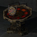
Yeah, ages like Vothol are very good example of quality texturing, but it's also a good showcase when it comes to lighting and models.
- Lighting, because while it has a nice dark red hue, it also has very bright cyan lights. This is enough to make it colorful while avoiding the claustrophobic feeling of a single color. Using only two colors (one dark and one light) is simple enough to do, and yet is visually pleasing and gives the location most of its feeling. And if you look carefully, this is used in most video games nowadays.
- Models, because the whole geometry feels smooth and flowing, some objects like the columns are not made of a single mesh, and some other are damaged to break the repetitiveness.
Clever balance between those three are what makes it a masterpiece, IMHO.