Guilds: a similar look

Anything that isn't directly related to Age Creation but that might be interesting to Age developers.

Re: Guilds: a similar look

Postby Justintime9 » Mon May 19, 2008 7:41 pm

There's an off topic section of this forum? :shock:
I never knew!
(and no, that's not sarcasm)
User avatar
Justintime9
 
Posts: 1188
Joined: Sat Sep 29, 2007 5:37 am

Re: Guilds: a similar look

Postby Pryftan » Mon May 19, 2008 11:21 pm

Recently added, Justin. ;)
.rilvoohee vehrehnehm vokan pam mahnshootahv rub voohee taygahnehm mahtahntahv
User avatar
Pryftan
 
Posts: 312
Joined: Fri Sep 28, 2007 10:17 pm

Re: Guilds: a similar look

Postby Justintime9 » Tue May 20, 2008 3:53 am

Ok, I played around with a screenshot of the GoMa website a bit, and came up with this:
Image
(you might have to right click>view it, and perhaps save it to desktop to see it clearly enough)
Do any of you think that looks better than it currently is? Or is it still just me?
User avatar
Justintime9
 
Posts: 1188
Joined: Sat Sep 29, 2007 5:37 am

Re: Guilds: a similar look

Postby Dot » Tue May 20, 2008 5:37 am

Thank you for your suggestions, Justin. Unfortunately, what you suggest is not as legible as the current design (e.g. choice of typeface).

I prefer a cleaner, simpler look.
User avatar
Dot
 
Posts: 172
Joined: Thu Feb 07, 2008 10:13 am

Re: Guilds: a similar look

Postby Tweek » Tue May 20, 2008 6:45 am

The Georgia font is generally ok for reading if the font size is set to 14px (or 1.4em if you have it set so that 1em = 10px) or larger, any smaller and they start feeling cluttered course expanding the letter spacing could go a way to help that I guess.
Beneath - IC Blog.
Beneath: Ages of Tweek - FB Age Dev Page.
User avatar
Tweek
 
Posts: 693
Joined: Sat Sep 29, 2007 6:37 am

Re: Guilds: a similar look

Postby pappou » Tue May 20, 2008 7:25 am

Justin, to my eye, your urge to pep up the GoMa page is a good intuition. However, I don't think your change in font styles is the the answer. Dot is right, in that your serifed style, “is not as legible as the current design...” Contrarily, your new type face in the logo at the top (moved to the right) does not seem to violate too much the sans serifed style of the existing body, and it adds a bit of relief. It gives the whole page just a hint of designed intervention.

That said, You and I must realize that functional legibility in type, once achieved, does not necessarily bring about an interesting page. The Maintainers seem to be of a different mind, but for me, if Justin wants to improve the Maintainer's page (really guys, there is room for improvement) it should be done as a matter of page design more than as type design, or even color design, alone.

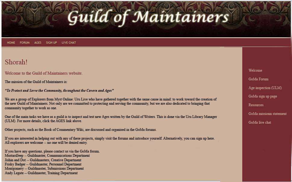
The standard GoMa page is composed of two horizontal bands at the top and one at the bottom. This does a good job of basic formatting for all pages using this form. It is has a variable body in between, in whic a variety of verticals may take place without violating the basic format. [Hmm. That was a gob of 'v' words in that sentence.] So, it is in this area of the body where improvements might more easily be made.

And indeed, it is the design of the body which might bring about a sexier looking page in general, while maintaining the general control now offered.

One suggestion: Subdivide the body into three columns:

This could be done by moving the left margin in, and using that extra space for headers;

Generally, the headers in brown type could start where they now do, while sub heads would move over in line with the newly indented margin;

This would give the body three vertical columns, but each column should be of a different size – using a proportionally significant relationship between them;


Another suggestion would be the possibility of using larger main headers font sizes, effectively introducing another size of header. I say this in order to break the blandness of the current body.

**********************************************
THE CONTRARY ARGUMENT:

The GoMa does not seem to want a sexy looking page, but being engineer-oriented guys, they want a sober presence. They want to look somber and down-to-earth to get across their investigative persona.

Of course, this vision is also the same one a cop would have, and they may find it difficult to be convincing: That they are the new maintainers – while wearing the same old stern clothes?

*********************************************
THE RESULT

So, Justin, does this sort of analysis give you any new ideas?
And don't let the Maintainer's glum face put you off; they are not the only ones who do not smile on change; they would not even be the only ones to refuse suggestions made by outsiders – if indeed they wind up doing this.

For me, the question is: Can you make a designed page body (assumed improvement) but which does not seem frivolous and out of character with the Maintainer's preferred persona?
pappou
pappou
 
Posts: 269
Joined: Mon Oct 15, 2007 6:27 am
Location: U of Texas @ Arlington (ret)

Re: Guilds: a similar look

Postby MustardJeep » Tue May 20, 2008 11:03 am

@Justintime9

A little to much mocca in the main body for many maintainers Justin, the color scheme/font was chosen so it would be eye strain friendly. Or at least that was why I voted for that particular color/font on the main body anyway.

The Main page for the Guild of Writers format is a tempting prospect for building the Maintainer Wiki's main page off of with a few tweaks. Currently the Wiki is set at the defaults, I still don't really have the time but I found some of the inspiration I need to get it off the starting blocks. :)

Ah midnight coding, bring it on! :twisted:

Anyway I am trying to figure out a nice format to include some pictures and ect.. so the Wiki pages will look more like newspaper or magazine articles rather then default format pages of blocky text. (This is not locked in stone, just a starting point for designing it.) The color/font scheme needs to be the same or very similar to the rest of the website however.

From pappou's post I would agree that we are engineer-oriented, and it may be a minimalist style layout but a lot of discussion went into it until it was something just about everyone was comfortable with. I'll be transferring over the original wiki style I had been working on prior to MO:UL closing later today, after that I'll PM you with a link to the Wiki. Oh yeah I also plan to make the offer to Tweek as well since he is uber creative but figure we can have some fun first building a rough draft acceptable to Maintainers.

If interested Tweek can proceed to blow us out of the water after we have had our fun. :lol:
MustardJeep
 
Posts: 129
Joined: Thu Oct 04, 2007 1:31 pm

Re: Guilds: a similar look

Postby Pryftan » Tue May 20, 2008 11:05 am

If you wish to submit suggestions to the Maintainers concerning their site design, there are proper channels to do so, and proper diplomacy to do it without insulting the people who worked hard to create the current design. They have their own forums, and will certainly appreciate suggestions posed in a friendly manner.

It might be best to put aside ideas of a unified structure or scheme. Something of the sort would introduce a whole new can of worms in the form of stifling bureaucracy. Explorers in general don't like being told what to do, and nobody's going to appreciate being told they should be like us just because we think our scheme is superior.

I don't want the current trend in this thread to continue, so I'm locking it on the behest of the Maintainers. You haven't gotten terribly belligerent yet but, you're stepping on their toes and we rely on smooth Guild relations to act, as Justin said, as different branches of a tree.
.rilvoohee vehrehnehm vokan pam mahnshootahv rub voohee taygahnehm mahtahntahv
User avatar
Pryftan
 
Posts: 312
Joined: Fri Sep 28, 2007 10:17 pm

Previous

Return to Off-Topic Discussion

Who is online

Users browsing this forum: No registered users and 1 guest