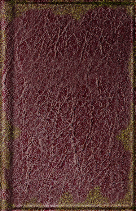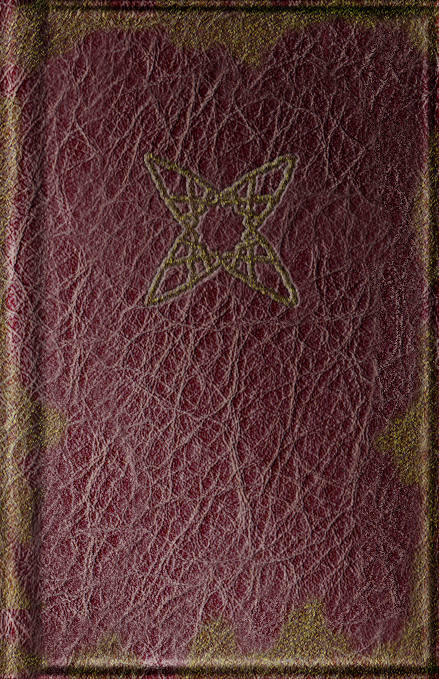
Now, there WILL be a symbol in the middle at some point, but it won't be added for awhile, so for now, just imagine it with a symbol in the center. Anyway, do any of you have any suggestions as to how I could make it better? (e.g better shading in some area, etc.) I want to make this as good as possible


